Studio - build a dashboard
The Studio designer is the web canvas running locally, so the ideas in Canvas basics and Charts apply here too. This page shows the Studio-specific controls.
Add and configure a chart
Section titled “Add and configure a chart”Visuals and Fields sit side by side on the left. Add a chart from the ribbon or a visual tile, then shape it in the Configure rail: the wells set the axis, the values and a series, and each value has its own aggregation.
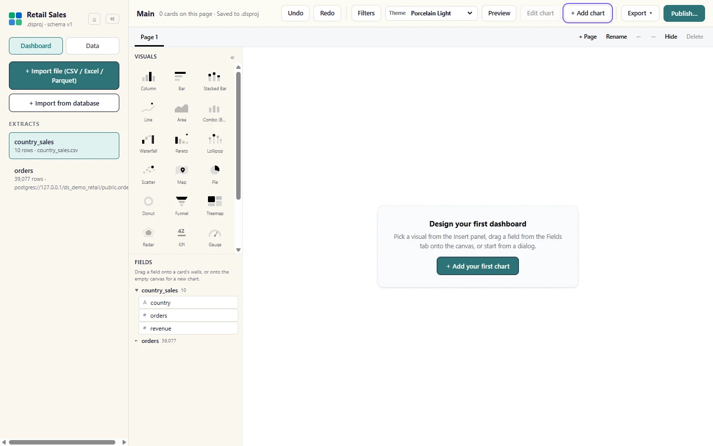
Open the Dashboard view. The Visuals and Fields lists sit side by side on the left (no tabs to flip between). Choose + Add chart in the ribbon, or + Add your first chart on an empty canvas.
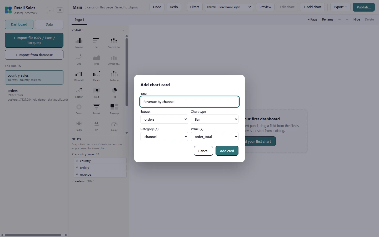
Give the chart a title and pick the extract, the Chart type, the category and the value, then select Add card.
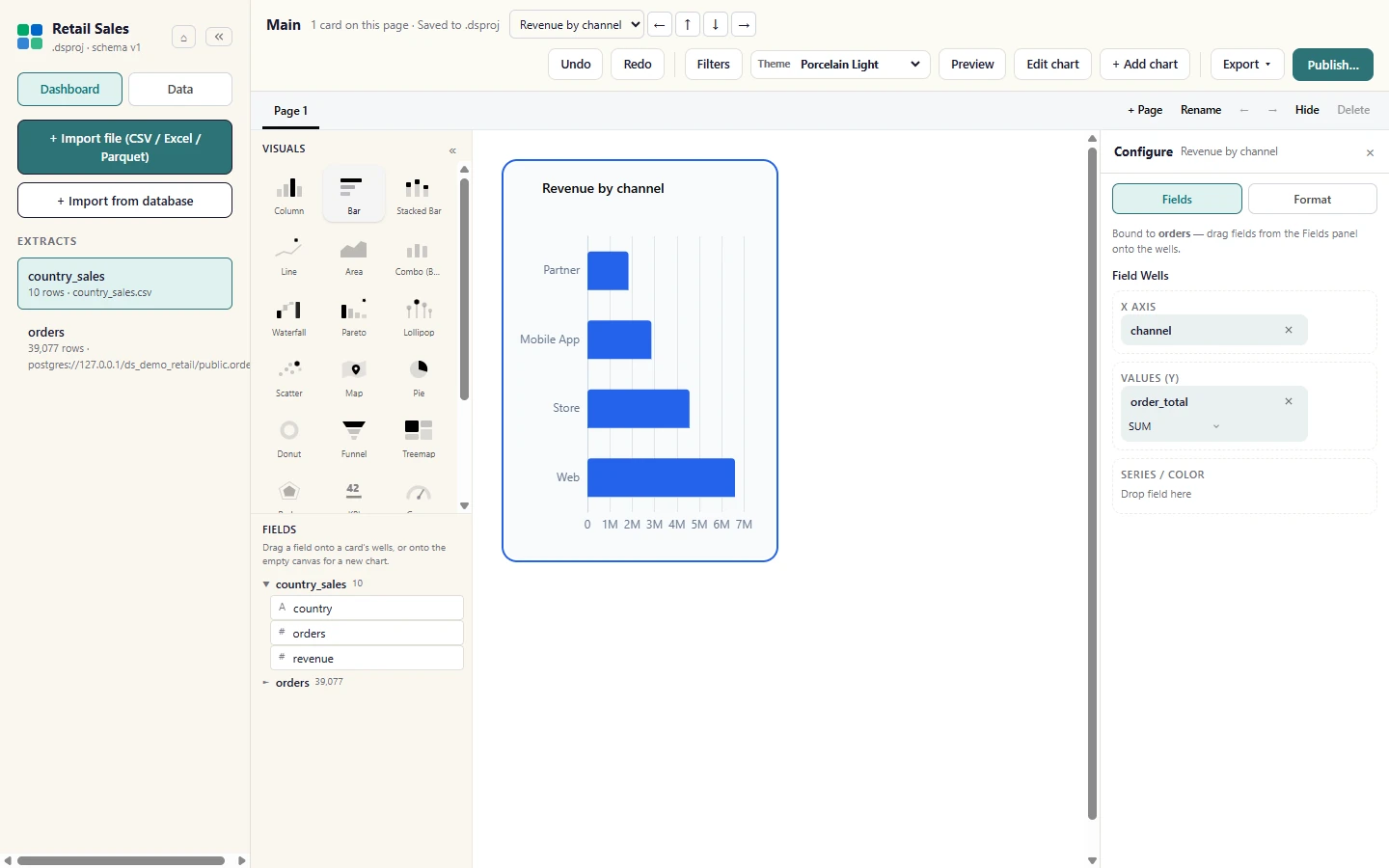
The card draws on the canvas at once, straight from the local extract. A selected card opens Configure on the right: Fields holds the Field Wells (axis, values, series or colour) and Format holds titles, colours and labels.
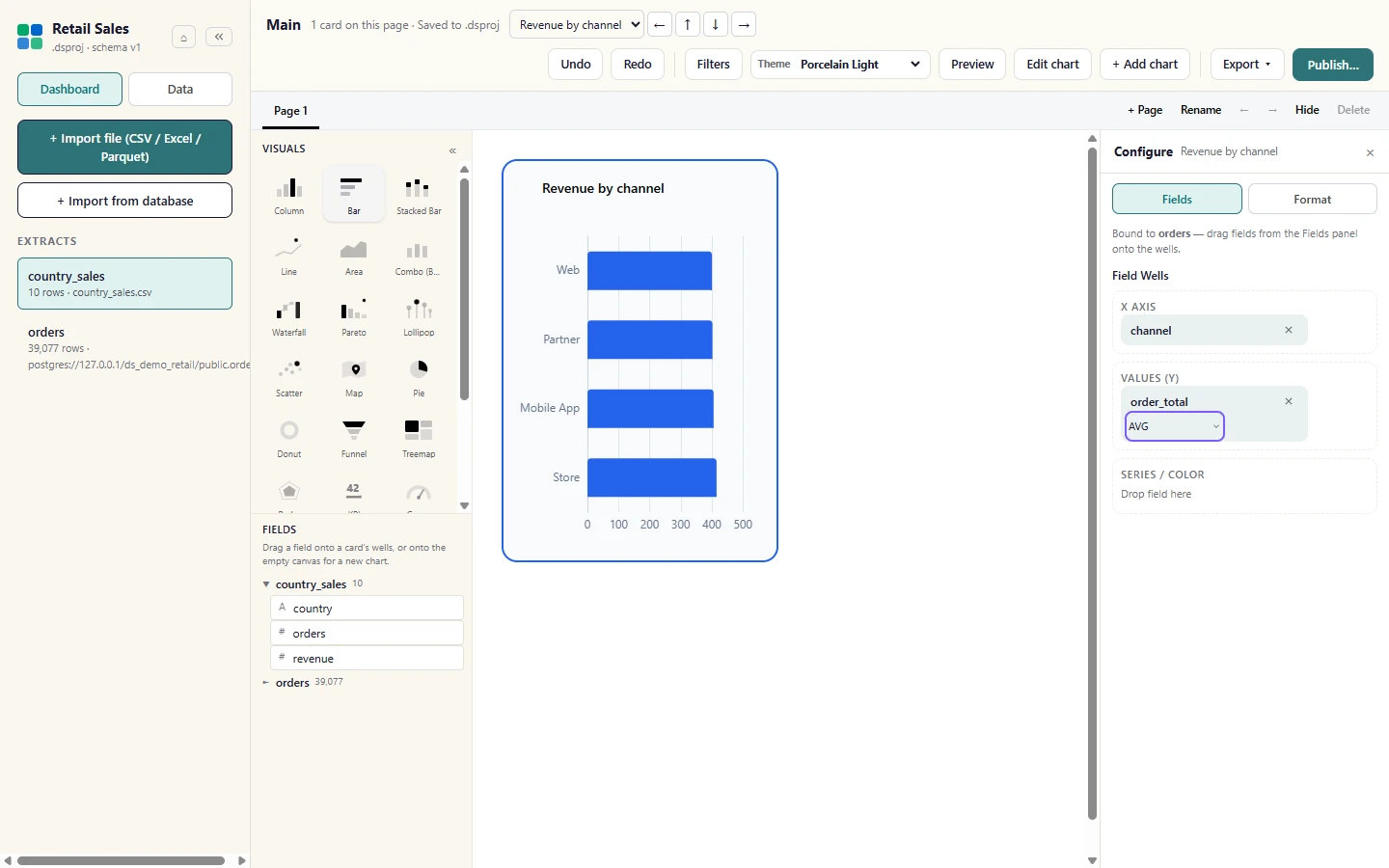
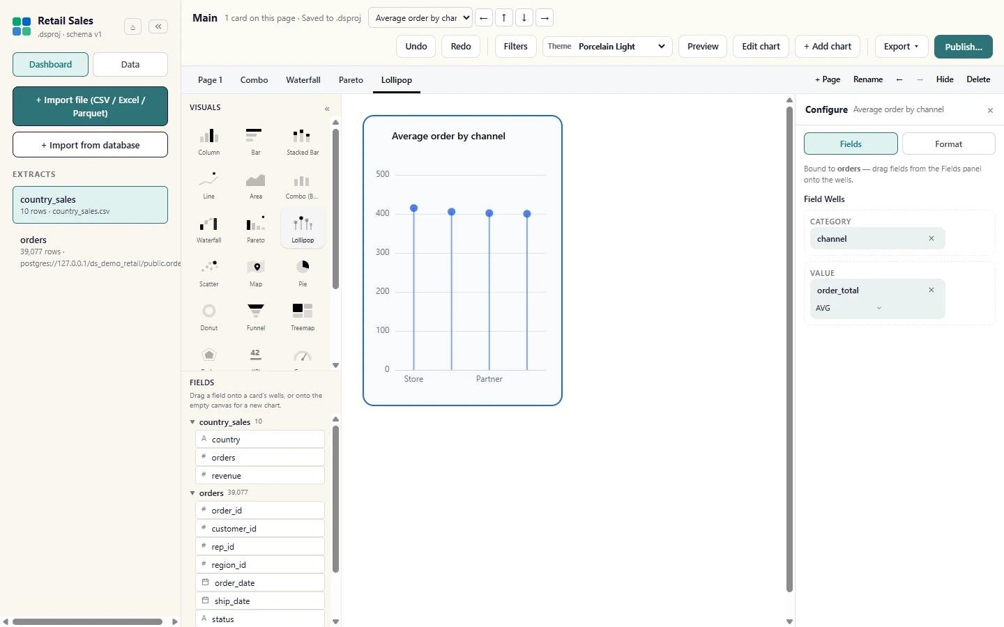
Each well holds fields for one role. Fields dragged from the Fields list into a well replace or add to it, and each value has its own aggregation: here SUM is switched to AVG and the bars redraw.
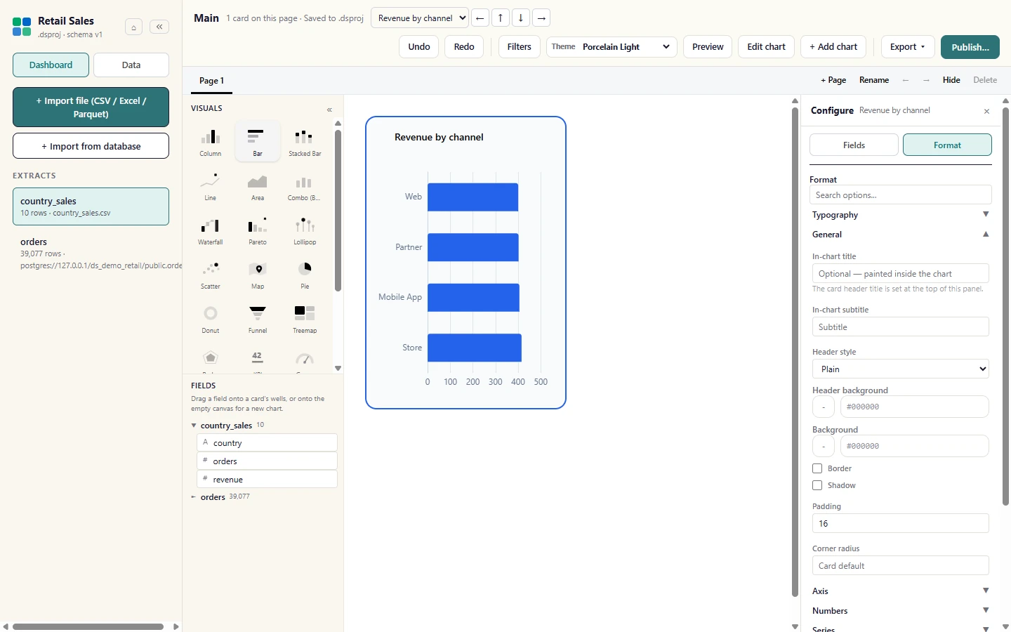
The Format tab beside Fields holds the look of the card: title, colours, labels and axes.
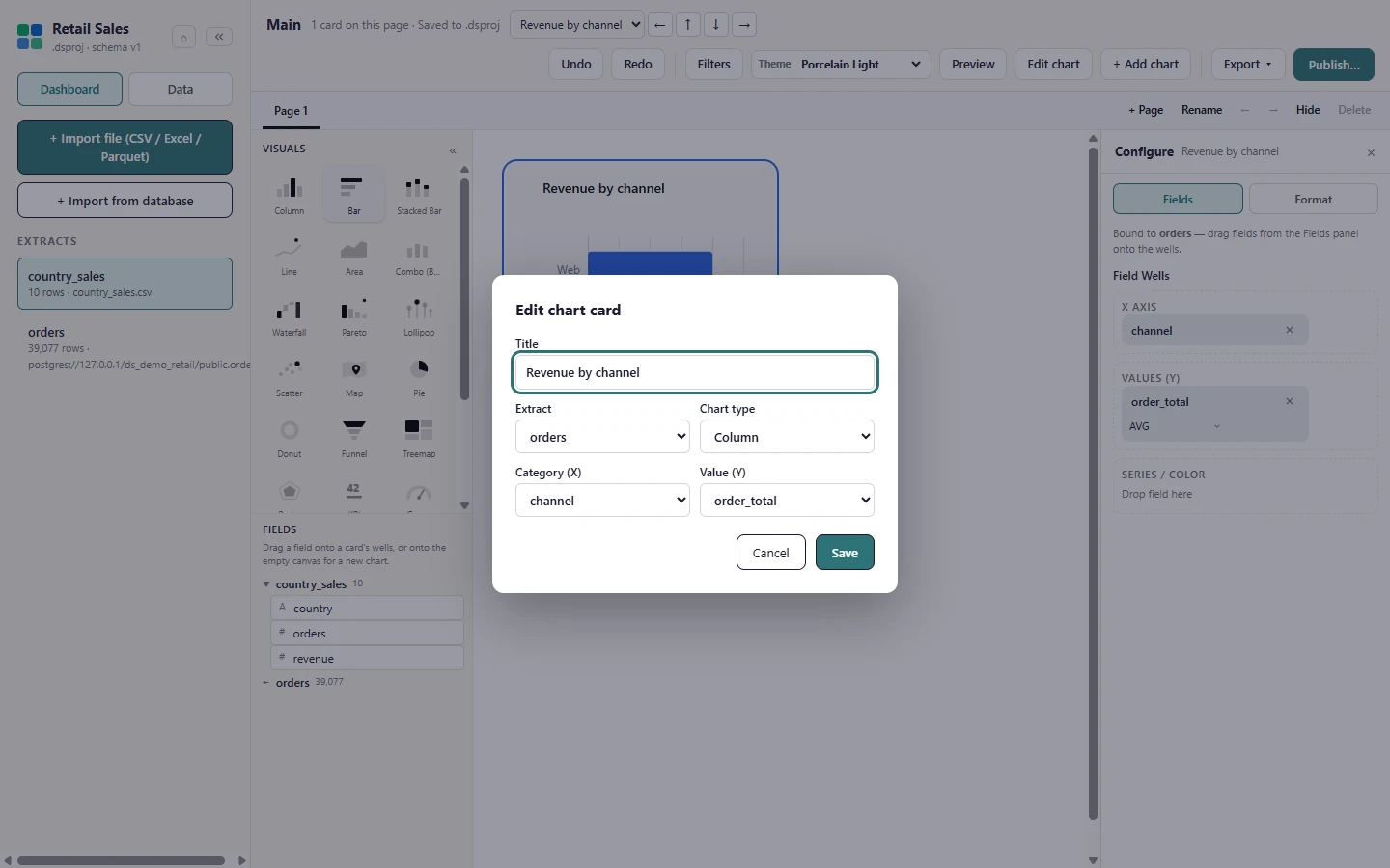
With a card selected, Edit chart reopens the dialog so you can switch its chart type (here Column) or change its fields.
Visual types
Section titled “Visual types”Studio draws the common visuals from your extracts. A Combo draws the first value as bars and the others as lines on a second axis; Scatter plots raw rows and is local-only for now, so publish reports it as not published; a Matrix crosses rows by columns with true totals.
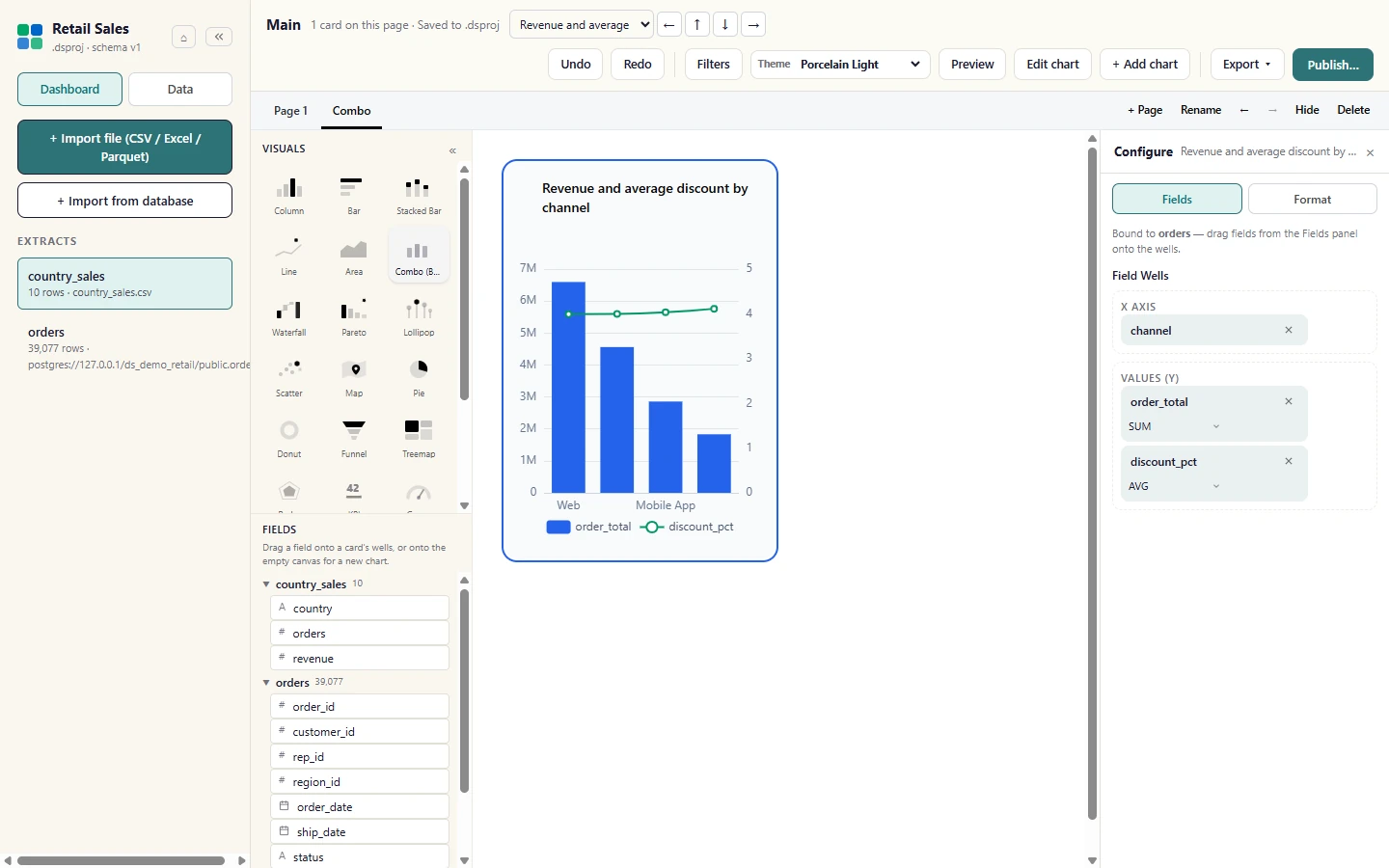
A Combo chart draws the first Value measure as bars and the other measures as lines on a second axis: here revenue (bars) against the average discount (line). The second measure was dragged from Fields into the Values well.
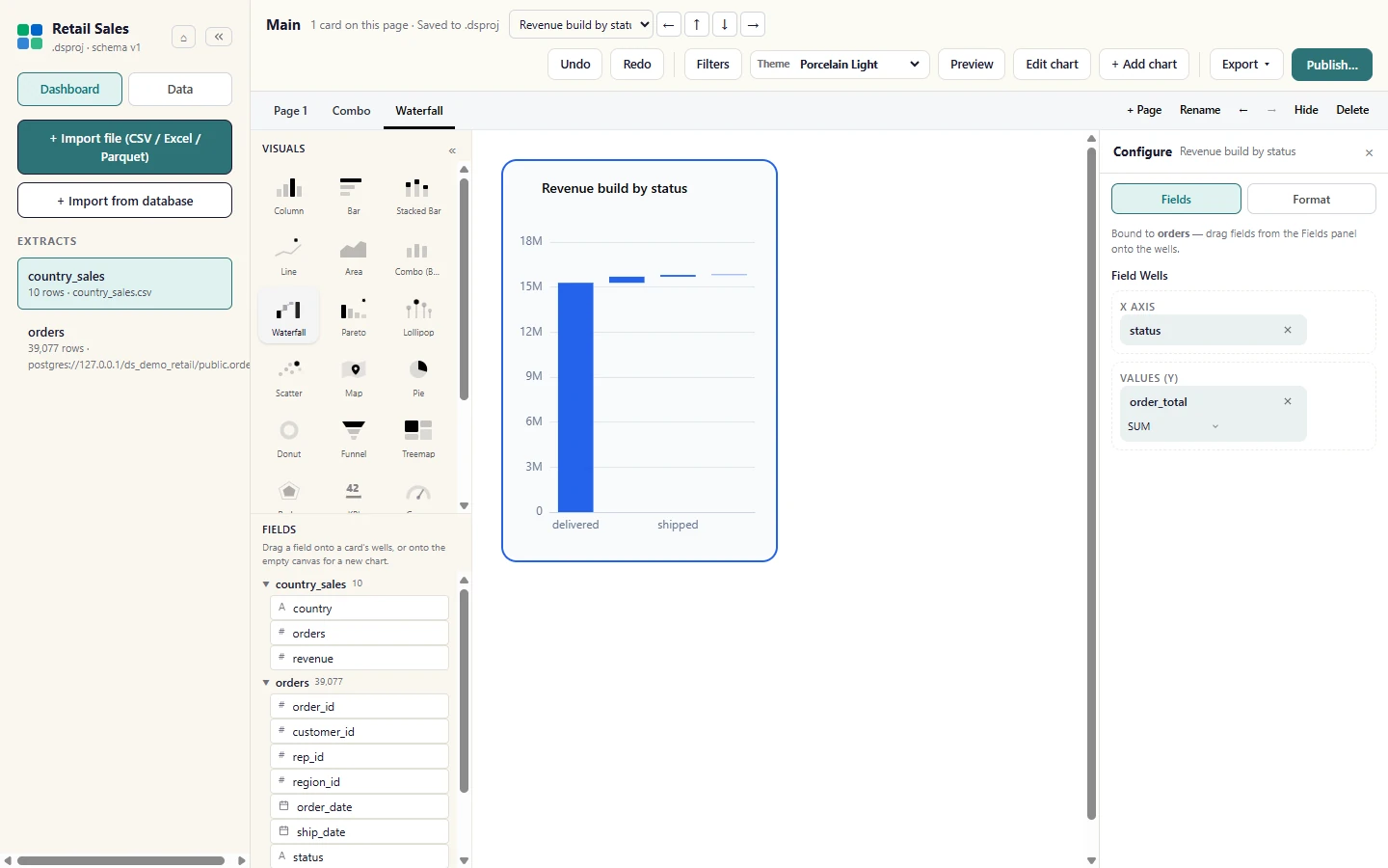
A Waterfall shows how each category adds to or subtracts from a running total.
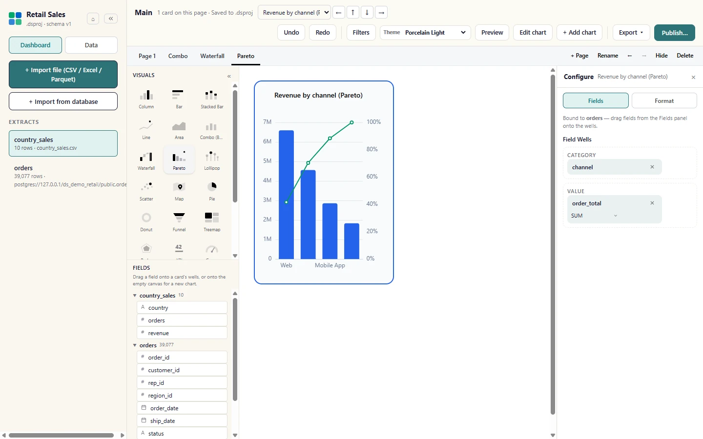
A Pareto sorts the bars from largest to smallest and adds the cumulative share as a line, to show which few categories carry most of the total.
A Lollipop is a bar chart with a line and a dot in place of each bar, which reads more cleanly when there are many categories or the values are close.
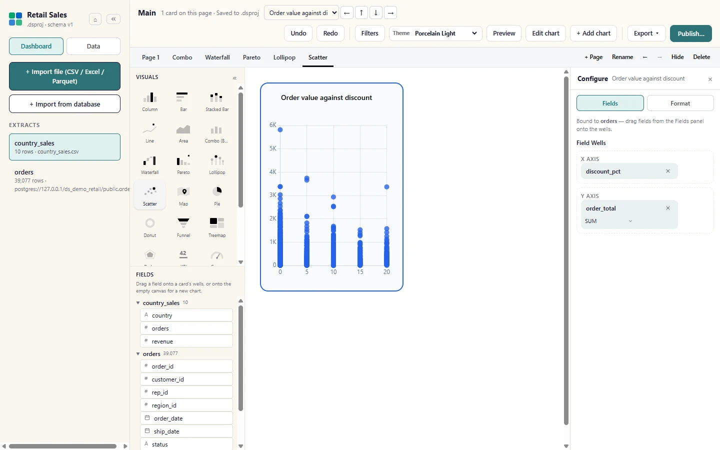
A Scatter plots raw rows as points (numeric fields only, 2,000 points by default). Scatter charts stay in Studio until the web app draws them the same way, so publish reports them as not published.
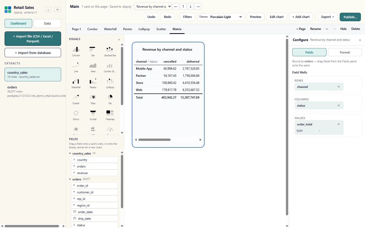
A Matrix (the Pivot Table tile) crosses Rows by Columns with Values in the cells. Here status was dragged into the Columns well. Totals are true aggregates from the engine, and selecting a row cross-filters the rest of the page.
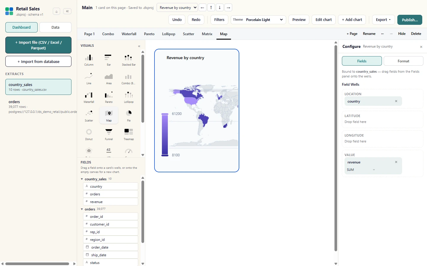
A Map colours each country by its value on a world map drawn offline from the bundled atlas. Names that are not on the map are listed in a note under the chart instead of being dropped silently.
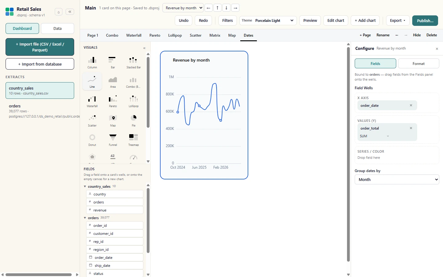
Drag a date field such as order_date into the X axis well and Studio groups it by month, so the chart has one point per month and not one per day. Group dates by in the Configure rail changes the grain: Day, Week, Month, Quarter or Year.
Filters, pages and slicers
Section titled “Filters, pages and slicers”Filters can apply to one page or to every page. Pages organise a dashboard, and a slicer card lets you filter the page with a list of values. See Filters and interactivity.
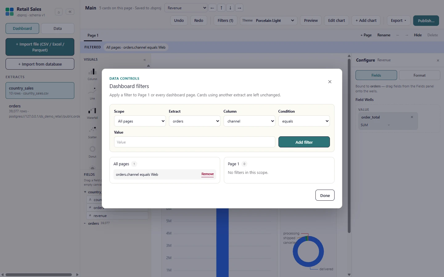
Select Filters in the ribbon. Dashboard filters opens, and it says "No filters in this scope." until you add one.
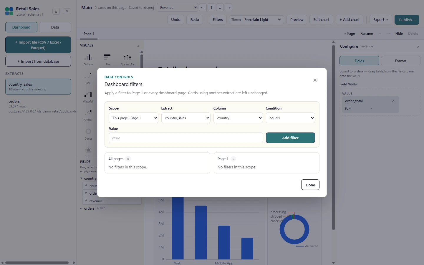
Choose the Scope (All pages or just this page), the extract, the column, the condition and a value, then select Add filter.
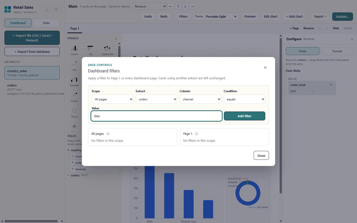
The filter is listed under its scope. Remove takes it off again; Done closes the dialog. Cards that read another extract are left unchanged.
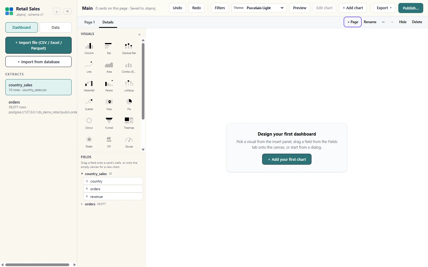
Use + Page to add a page (here Details). The tabs above the canvas move between pages; Rename, the arrows, Hide and Delete act on the page you are on.
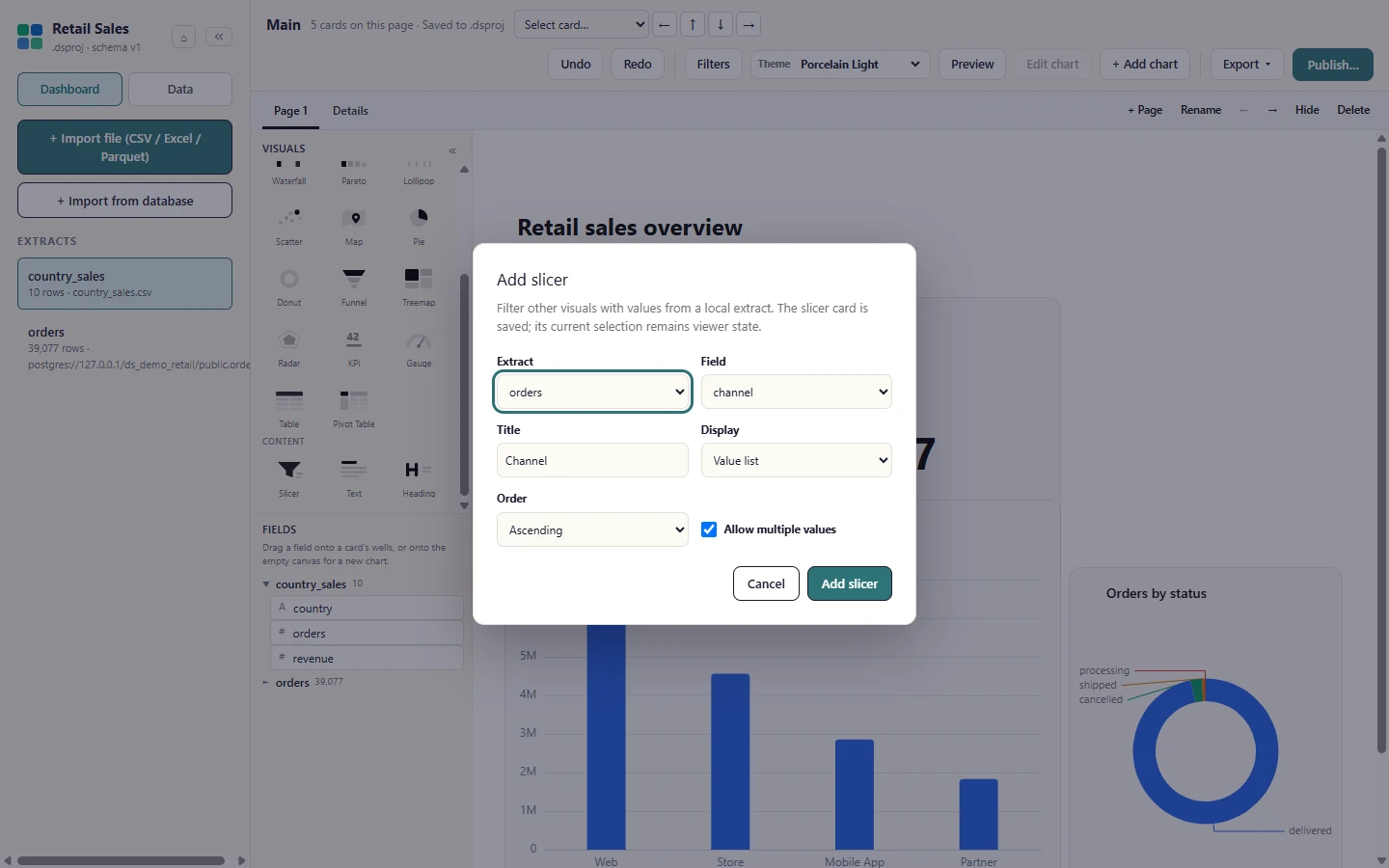
To let viewers of your own preview filter by a field, add a Slicer from the Content tiles under the visuals: pick the extract, the field and how it displays.
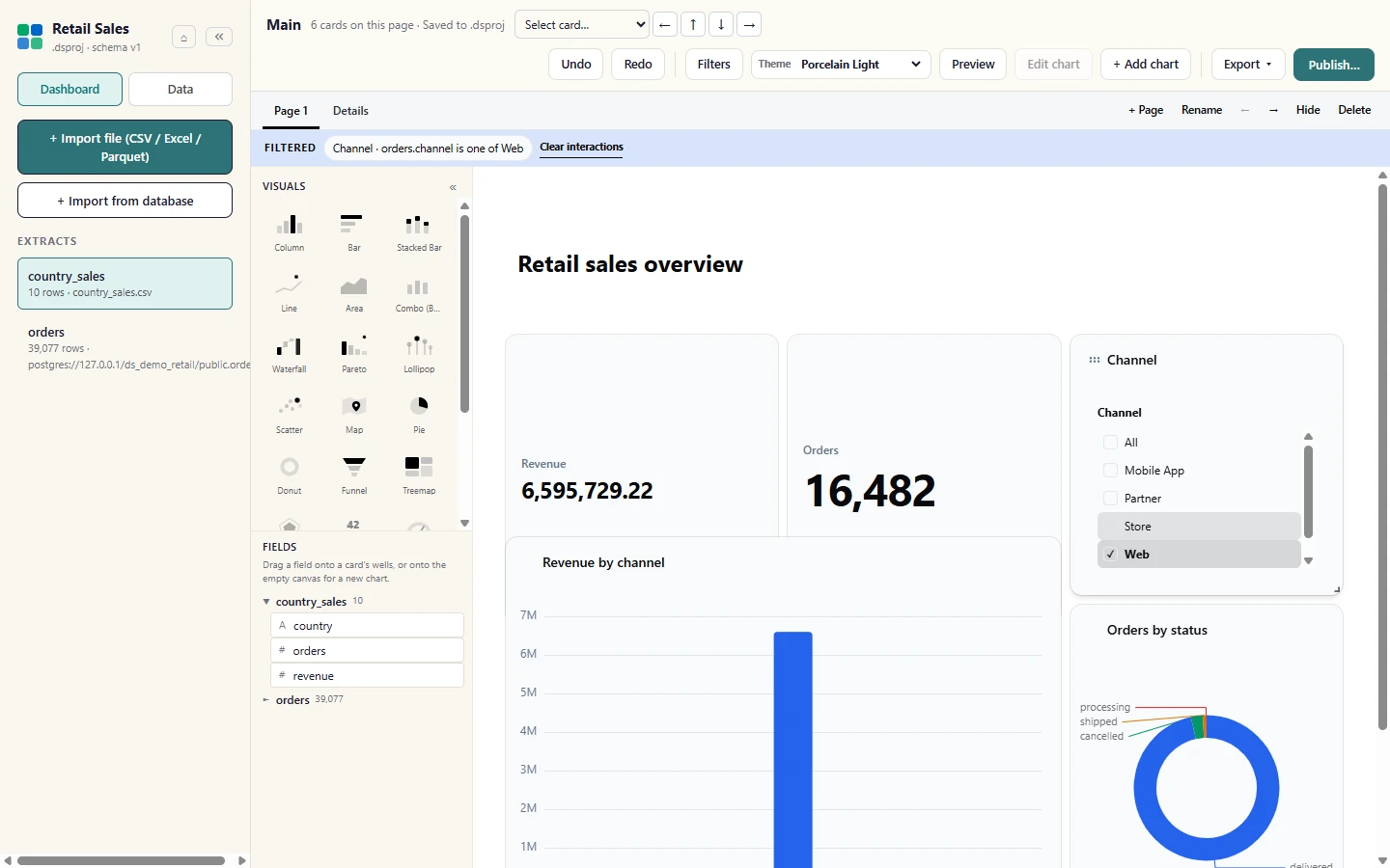
Select a value in the slicer and every other card on the page redraws for it. A click on a chart element cross-filters the same way; Clear interactions resets both.
Theme, preview, undo and delete
Section titled “Theme, preview, undo and delete”Pick a dashboard look from Theme in the ribbon. Colours, fonts and chart palettes change together, and the choice is saved in the project.
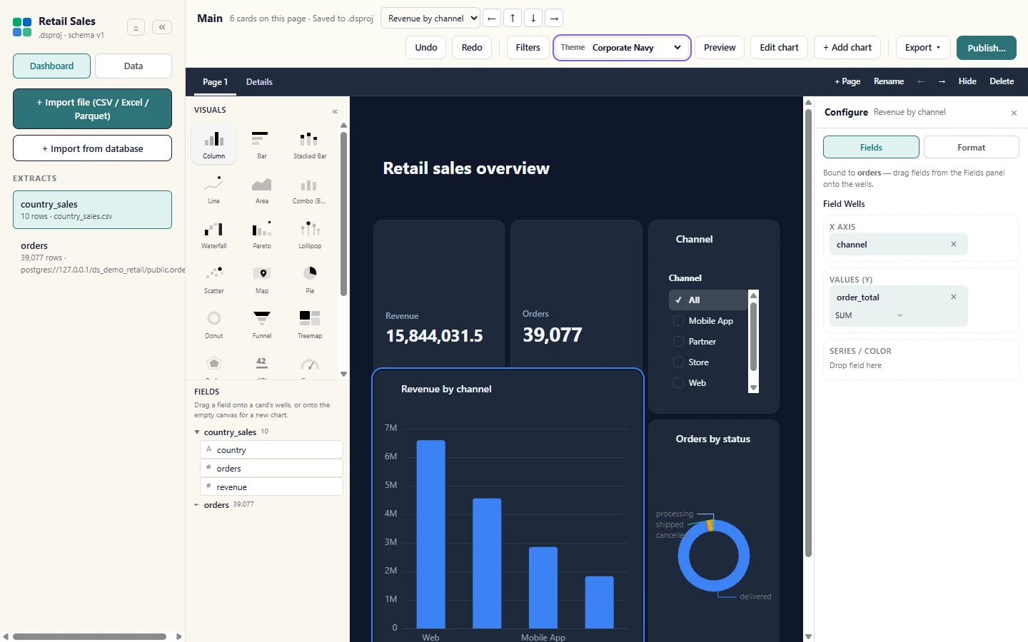
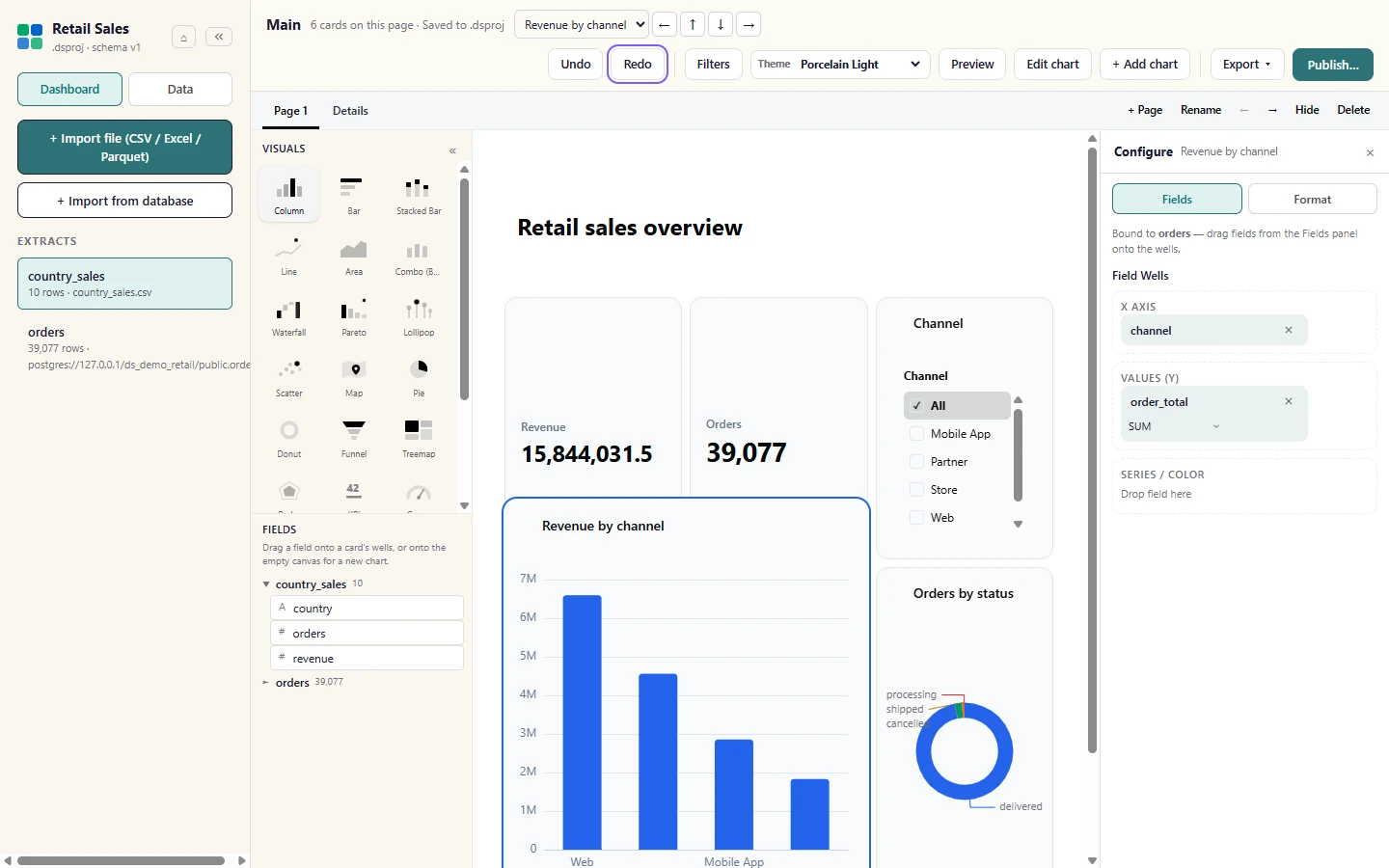
Undo reverses the last edit (here the theme change) and Redo puts it back. Both also work from the keyboard with Ctrl+Z and Ctrl+Y.
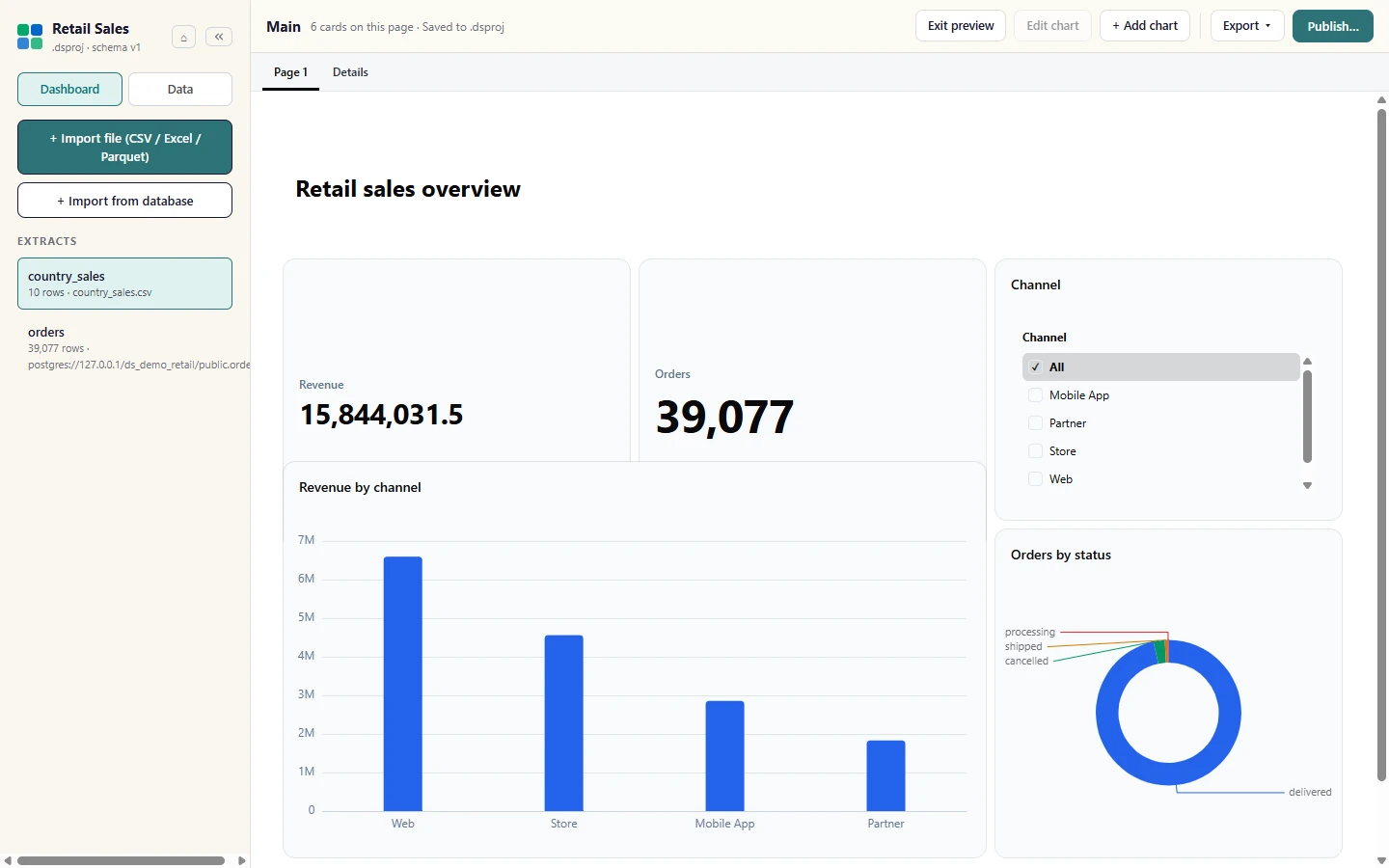
Preview shows the dashboard the way a viewer sees it, without the designer panels. Select Exit preview to go back to editing.
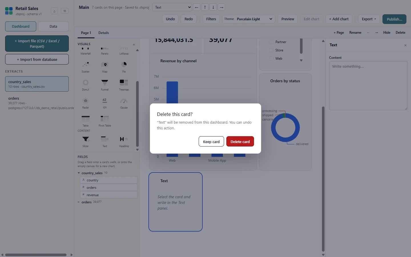
Deleting a card asks first: right-click a card, choose Delete, then Delete card to confirm (Keep card cancels). Undo brings a deleted card back.
See Themes for how dashboard themes work on the web.
Export a page
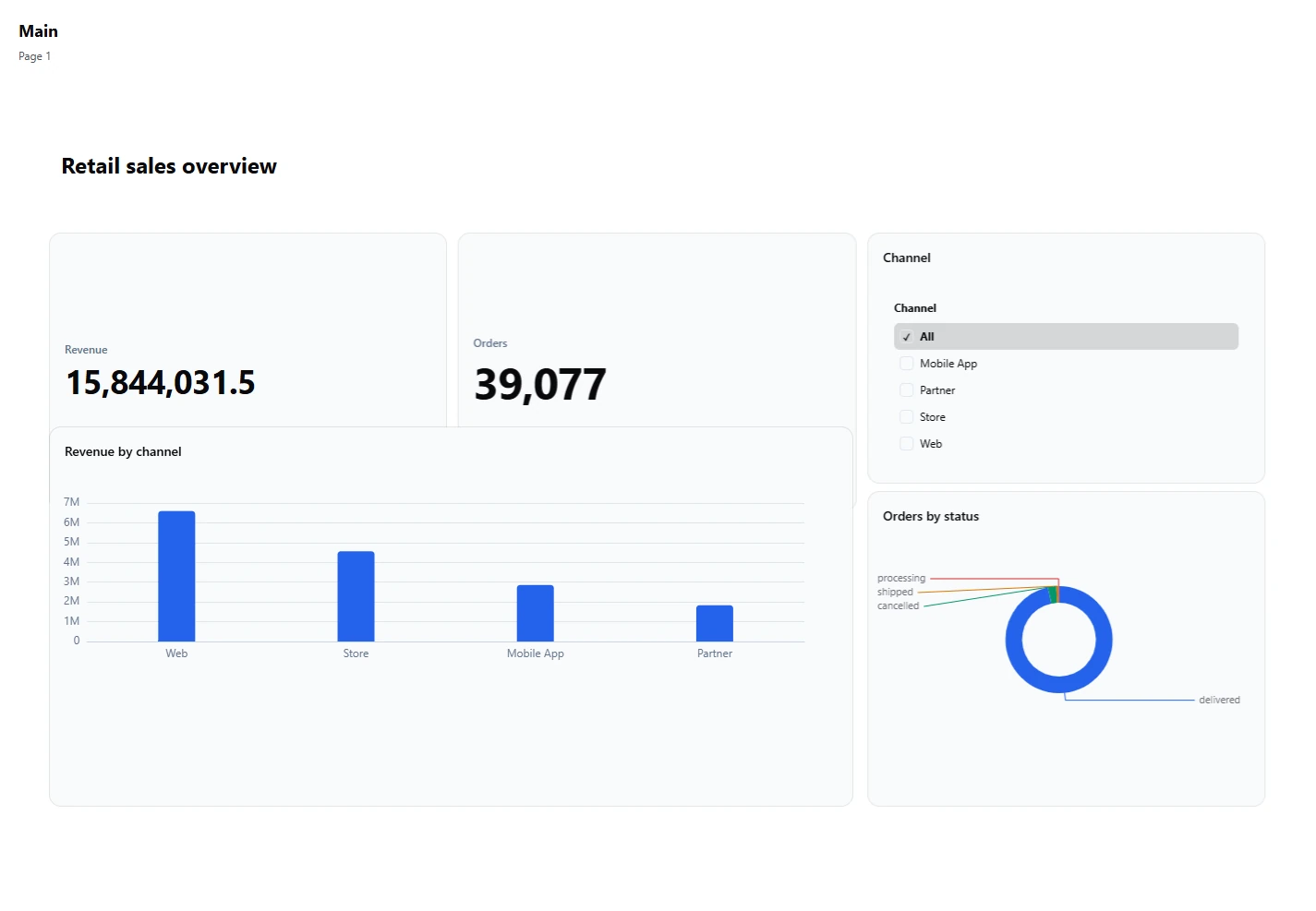
Section titled “Export a page”Export writes the whole canvas as a PNG or PDF, or every visible page as its own PNG. See Exports for exports from the web product.
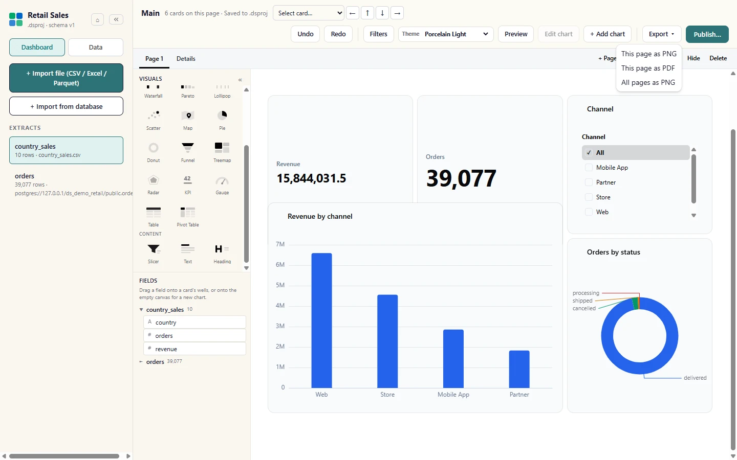
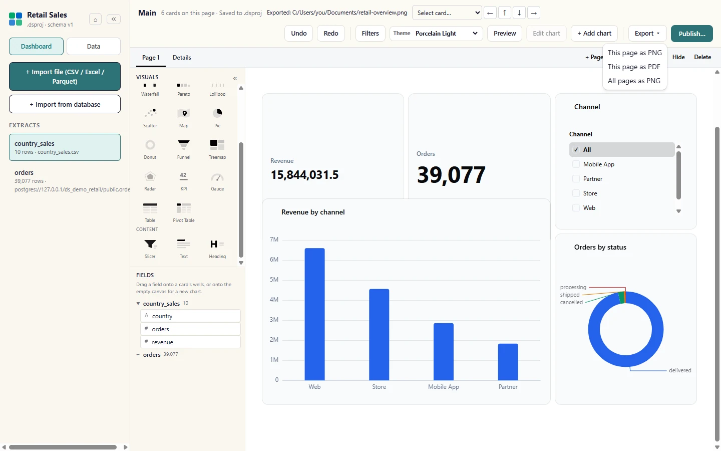
Open the Export menu in the ribbon. This page as PNG and This page as PDF write the page you are on; All pages as PNG appears when the dashboard has more than one visible page.
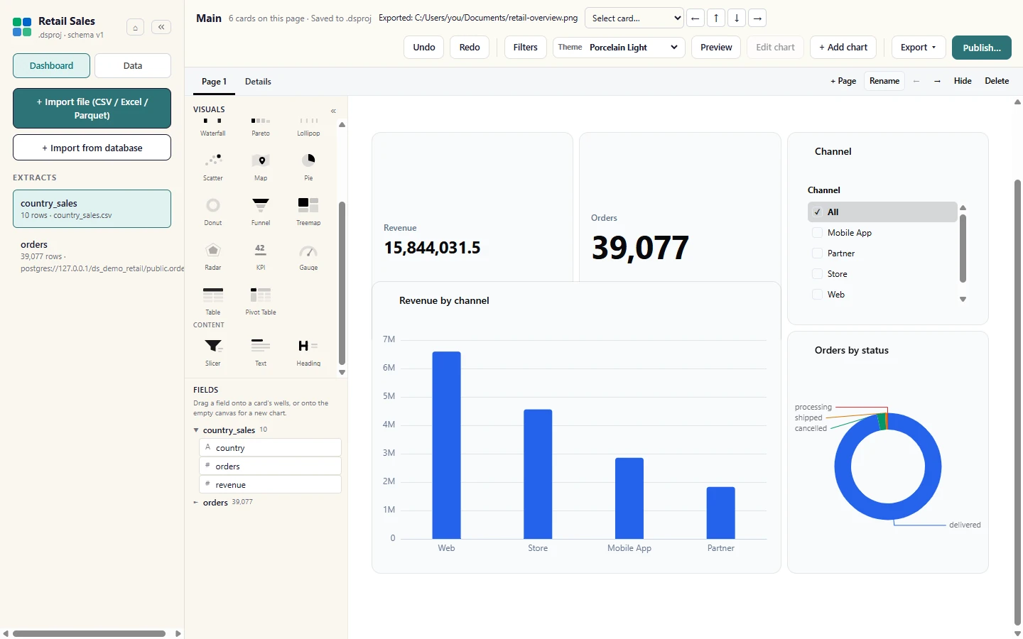
Choose where to save the file. Studio writes the whole canvas, not just the part on screen, and confirms the location above the canvas.
The exported PNG holds every card on the page at full size.
With several pages, All pages as PNG asks for a folder and writes one numbered image per visible page.
Next: publish to a workspace.