Canvas basics
A dashboard is a canvas of cards — charts, tables, KPIs, text, images, parameters, and filters — arranged on a grid across one or more pages.
Adding cards
Section titled “Adding cards”Open the Insert tab in the left panel. A Popular row covers the common picks (Column, Line, Area, Pie, KPI, Table, Stacked Bar, Combo), and the full palette is grouped by what you’re trying to show — comparison, trend, composition, distribution, relationship, geo, indicators, data, content, shapes, and filters. See Charts & formatting for the complete list.
Beyond charts, you can insert:
- Content cards — Text, Heading, Image, Divider, Link, Button (navigate to a page or URL), Embed (iframe), and SQL (drop a SQL query result straight onto the canvas via the query dialog).
- Shapes — rectangle, ellipse, triangle, line, arrow, and Callout notes (info/success/warning/danger) for annotation.
- Filter cards — Dropdown, Multi-select, Number range, and Date range; see Filters & interactivity.
- Blocks — ready-made presets: a KPI row (three KPIs) or a Section (heading + divider).
When you have multiple pages, newly inserted cards drop directly onto your active page, or you can drag cards across pages in the Pages rail.
Multi-page dashboards
Section titled “Multi-page dashboards”The Pages rail on the left manages the dashboard’s page structure:
- Add, rename, and reorder — create new pages, drag tabs to reorder, or rename pages to structure multi-level executive decks and detail views.
- Duplicate page — clone an entire page with all its cards and layout intact.
- Page Settings — configure per-page background color or layered background image, adjust page padding, or set a fixed max-width for centered canvas layouts.
Configuring a card
Section titled “Configuring a card”Select a card to open Card Settings with three tabs:
- Data — the field wells (what the chart shows), per-card filters, SQL bindings, quick-calculations, and row limits.
- Format — every visual option, searchable; see Charts & formatting.
- Layout — exact numeric position (X / Y / W / H) in grid units.
Header presets & chromeless cards
Section titled “Header presets & chromeless cards”Card headers offer five presets — Plain, Accent bar, Filled band, Underline, and Minimal — so all cards share one visual rhythm without hand-styling each. For bespoke layouts and infographics, you can also toggle chromeless cards to hide the card container, background, and borders entirely.
Card-level controls
Section titled “Card-level controls”Attach interactive controls (tabs, dropdowns, or segmented toggles) directly to a card header so viewers can switch lenses — such as toggling between Actual, Budget, and Forecast — without affecting other cards on the canvas.
Add to Report
Section titled “Add to Report”Promote any dashboard visual directly into a paginated report: select Add to Report from the card’s menu to launch the report block placement dialog.
Parameters and variables
Section titled “Parameters and variables”Define dashboard-level parameters in the Parameters Manager:
- Support for text, number, date, boolean, and list parameter types with configurable default values.
- Bind parameters to SQL card queries or filter cards to dynamically control query clauses and card expressions across the canvas.
- Configure auto-apply or explicit apply triggers for parameter changes.
Finding fields
Section titled “Finding fields”The left panel’s Fields tab holds the Models & Fields tree — the source of everything you drag into a field well. Type in Search fields… to cut through a large model:
- It matches model, table, and column names, and SquareX measure names.
- It auto-expands and loads tables you have never opened, so a match surfaces even from inside a collapsed table. Match a table’s name and you get that table’s whole field list.
- Clearing the box restores your own expansion state — it doesn’t collapse everything you had open.
Drag a result onto a well exactly as you would from the tree.
Designer modes
Section titled “Designer modes”The editor has three modes, so you can work at the right altitude:
| Mode | For |
|---|---|
| Arrange | layout only — move and resize cards without accidentally editing content |
| Edit | the full authoring chrome (data wells, formatting, parameters, layers) |
| Preview | see and test the live dashboard exactly as viewers will (including full cross-filtering, hierarchy drill-down, and card controls), without leaving the editor |
Focus and Present
Section titled “Focus and Present”- Focus mode expands one card into an overlay (with its own fullscreen
toggle) — for reading a dense table or presenting a single chart.
Escexits. - Present switches the whole dashboard to true browser fullscreen for meetings; the button flips to Exit. Page tabs keep working in Present mode, allowing you to present a multi-page dashboard like a deck.
Saving, concurrency, and undo
Section titled “Saving, concurrency, and undo”- Optimistic concurrency control — the editor uses concurrency tokens to protect your work. If another collaborator or browser tab saves changes to the same dashboard, you are prompted with conflict options rather than silently overwriting changes.
- Saving —
Ctrl+Ssaves immediately. - Undo & redo —
Ctrl+Zundoes actions andCtrl+Shift+Z(orCtrl+Y) redoes them. Delremoves the selected card, andCtrl+Kopens the command palette. The full list is in Keyboard shortcuts.
Publication and governance
Section titled “Publication and governance”- Draft vs. Published — keep work in draft state while building; publish when ready for viewers.
- Data Quality publication gate — when publishing, DataSquares checks the status of critical data quality rules on the underlying data models. If critical checks are failing, a quality-gate warning/block dialog alerts you before publication.
- Stage Promotion & ALM — promote dashboards across environments (dev,
staging, prod) with field-level diff inspection (
DashboardDiffDialog) and version snapshot rollbacks.
AI on the canvas
Section titled “AI on the canvas”- Per-card AI summary — authors can generate and save an AI summary directly on any data card, giving viewers an instant natural-language breakdown.
- Card insights — run “Explain this change” and “Analyze” (anomalies, key influencers, forecasts) right from the card menu.
- AI Generator — generate complete dashboard layouts and card compositions using natural language prompts in AI chat.
What viewers get
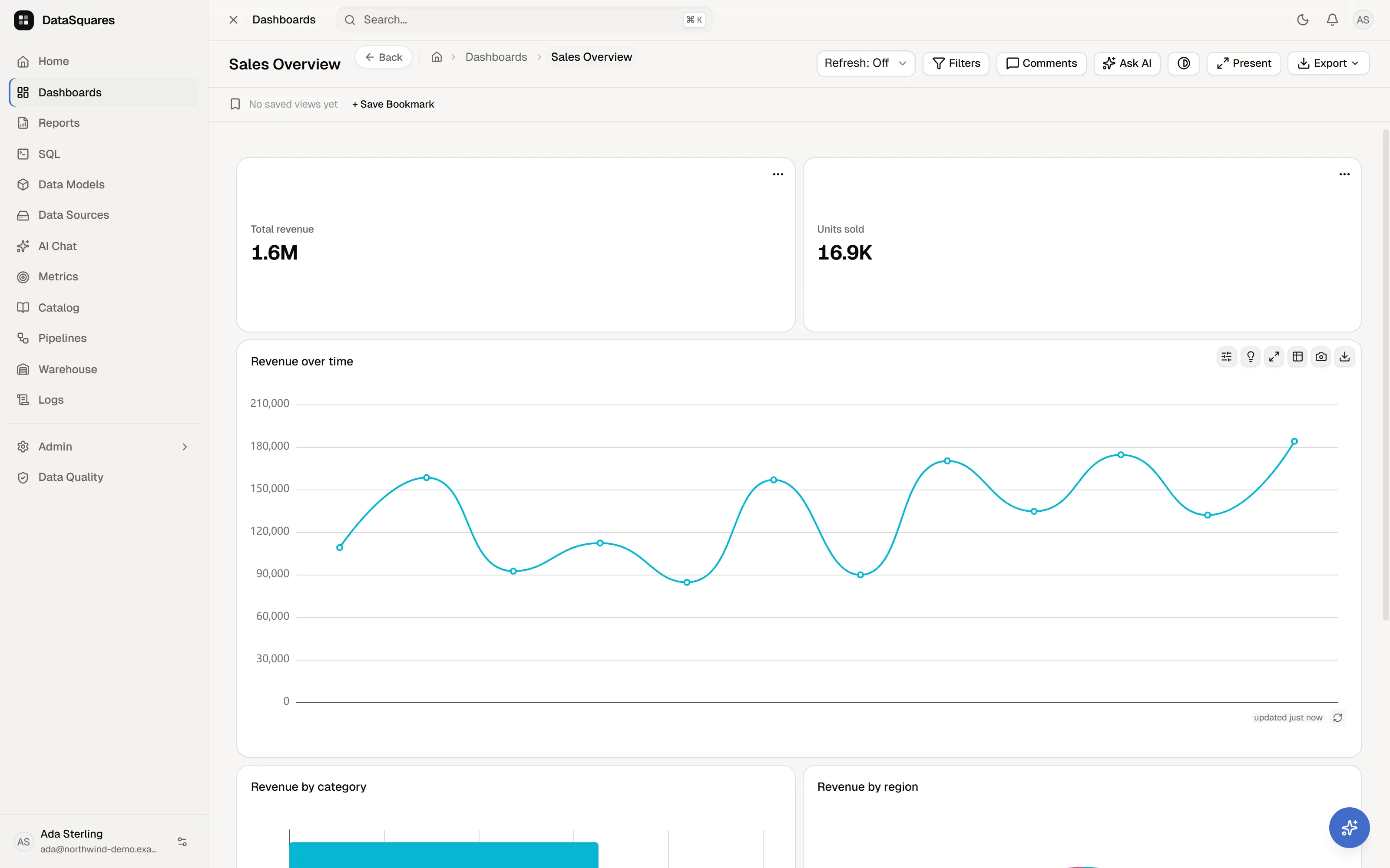
Section titled “What viewers get”People with view access get the same dashboard minus the authoring chrome: they can filter, cross-filter, drill down hierarchies, use card controls, save bookmarks (Saved views), comment, refresh, present, ask AI, set metric alerts, and export — but not move, edit, or add cards. The full viewer guide is Exploring dashboards; access details in Sharing.